Motivation
The robustness of a complex system 1 is defined as its ability to maintain a steady state regardless of the change in the inputs to the system. Biological systems are robust in the sense that, given different environments and exposures, they maintain homeostasis and life.
A Stress Test in the medical sense is the intentional exposure of the cardiovascular system to activities that push the normal functions beyond their day to day parameters. Cardiovascular function is measured and compared, and then, one either gets a clean bill of health or one undergoes further investigation, or treatment. 2
Stress Testing is a way of checking the robustness of a product or system, and is used in nearly every professional field, in one form or the other.
Covid19 is a Stress Test on modern life as we know it. And as the world decides to open up, I wanted to take a snap shot of how we’re doing, so far.
Approach
SARS-CoV-2 (the virus) spreads through human to human contact 3. Is there a correlation between density of population to the spread of the disease? It seems, intuitively, to explain why NYC and Mumbai have more cases and, hence, deaths as compared to LA and New Delhi. We also know that the spread of SARS had a spatio-temporal component 4. Generally speaking, all communicable diseases do.
What is also clear, now, is the fact that those with pre-existing, non-communicable, diseases such as Hypertension, Type II Diabetes, COPD, and certain kidney disorders, have a higher risk to develop severer forms of the disease. They also have a higher chance of succumbing to it 5 6 7. The cardio-metabolic derangement associated with Obesity and Type II Diabetes is referred to as Metabolic Syndrome (MetS) 8 and it is well known Inflammation modulates the underlying metabolic derangement 9. Given the role of Hyper-inflammation, or abnormal inflammatory response in some patients, and its association with poorer outcomes 10, it’s clear that there is a link between death, due to the exposure to the virus, and inflammation mediated damage 11.
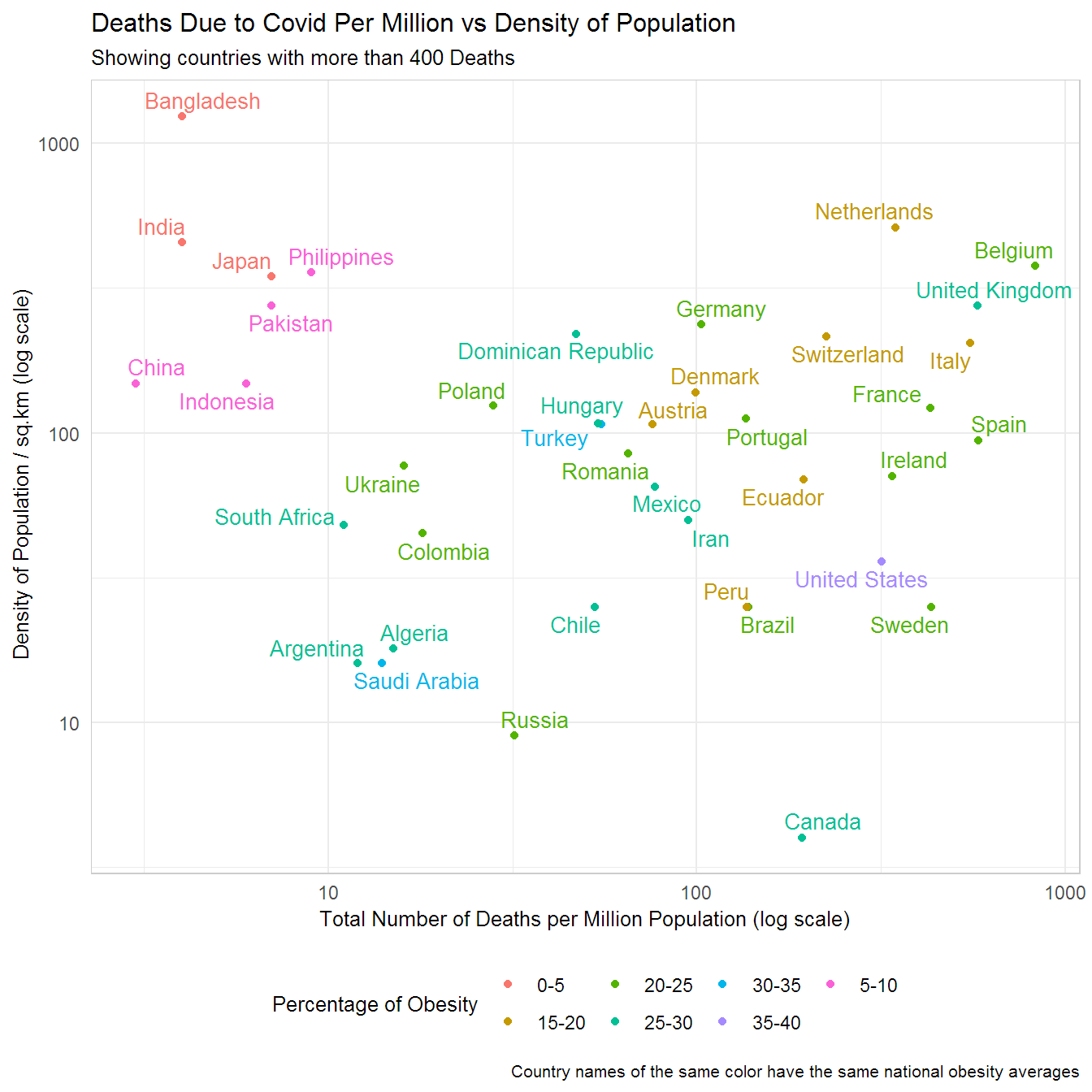
Given the above, and to prove a point on WhatsApp, I decided to create a plot of Country wise Covid Death Rates by Population Density, to see if there is indeed a relationship. However, considering what we know about the mechanism of injury, the representation needed to take into account the prevalence of underlying co-morbidities. An easy proxy was use the percentage of Obesity in every country. While this isn’t perfect, as an exploratory exercise, it could suffice.
Here’s the plot…
Discussion
There are a few things going on over here so let’s break it down. Note, this is an exploratory data analysis exercise. The idea over here is to generate observations that one can track, but also, to generate hypotheses as to why the data are presenting in such a way.
- Interpreting the Log Scale 12.
- Both axes are on the log scale. Why? Because it’s easier to visualize the gaps between the data. But also, a lot of biological systems (and nature in general) don’t work on linear scales.
- Here, the numbers increase an order magnitude per unit increase. What that means is that Canada has more than 10 times the deaths per million than Argentina. Even though Belgium seems twice as far from Argentina, it’s approach 100 times the number of deaths.
- Obesity
- Countries in Red have the lowest national averages of Obesity. Note, this is 2016 Data.
- The United States (in Pink) has the highest rate.
- Obesity is defined by the WHO has a BMI >= 30 13.
- Density of Population
- Countries to the top of the plot have higher average density of population.
- Canada is right at the bottom. It has the lowest in this group.
- Total Deaths per Million
- Belgium (to the right) has the highest deaths per million in this group.
- India and Bangladesh have the lowest, but consider that Bangladesh has a higher density of population.
- Viewing the Diagonal
- Countries in Blue and Green(s) seem to be clustering in such a way that suggests there’s a correlation between population density and total deaths.
- There will be an update shortly after we run a linear model on the data.
- The reds along with the browns and the pinks are opposed to each other and hence have vastly different rates of obesity and in this plot deaths per million population, too.
- Countries in Blue and Green(s) seem to be clustering in such a way that suggests there’s a correlation between population density and total deaths.
- Viewing pairs
- Hungary and Turkey have similar deaths and similar density of population, but Turkey has a higher rate of obesity. Is one doing something better or worse than the other? Are there other factors at play?
- Sweden’s death rate when contrasted with the US seems worse given that its population is less obese on average.
- Focus on Asia and the Subcontinent.
- They seem to be doing better than expected.
- Is it because they have lesser individuals with co-morbidities?
- They seem to be doing better than expected.
Some aspects to consider. Infections and outcomes of exposure to harmful viruses and bacteria depend on a range of factors. In medicine, they are usually clubbed into:
Agent Factors, such as type, strain, virulence, etc.
Host Factors, such as immune function and immunity status, along with susceptibility to agent and general health status.
Environmental Factors, such as temperature, humidity, and other factors extraneous, but influential to inter Agent - Host interactions.
Public Health/Health Infrastructure, such as accessibility to care.
July Update - Notice how the relative position of some countries may have changed.
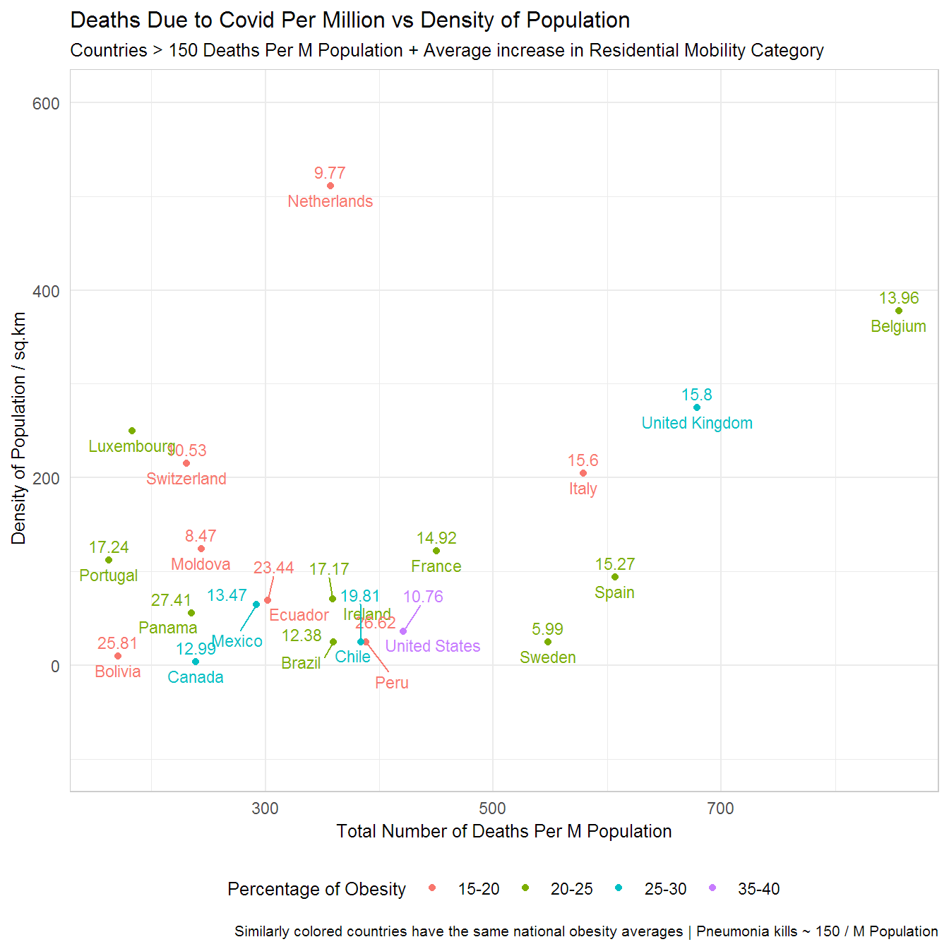
I added the average decrease in Mobility (Staying at home category) as a comparision, because you know Sweden is doing its own thing. Google Mobility Data Accessed July 13th 2020 and is available from this (link). Pneumonia Stats from the CDC.
For those of you who like interactive data I’ve created a plot with all the countries using plotly. Note this plot is current as of 24th May. What could be the possible reasons for the differences seen? Try interacting with the plot. Clicking on the dots in the legend toggles which countries are displayed. The Compare data on hover feature is very useful, too.
Conclusion
A colleague asked me to participate in a focus group, in early April, as part of an exercise to describe the new normal (whatever that means). This was my answer to the question How do you imagine your life will be after the quarantine in the first month and in the following 6 months? The report makes for interesting reading 14.
1 month - I imagine the small things/personal freedoms that we take for granted will feel more valuable. However, it’s unclear to me which non-essential activities will resume after the CA shelter-in-place is lifted/relaxed. However, what ever does open up, I suspect there will a rush to embrace it. Playgrounds for the kids, and BBQs for the adults are two activities that I know we are looking forward to. I’ll definitely go out to the beach and spend a few hours listening to the water and waves crash into each other. Given the weather there will be more outdoor beer garden style get togethers than indoor ones, imo.
6 months - I suspect until we all test positive for exposure to the virus/develop a vaccine there will be more mask wearing/more awareness about flu like symptoms/messages around personal hygiene. I think that will be the new normal for the first 6 months. I suspect there will be hot-spots and vacillating periods of complacency and heightened awareness. This period will be mentally exhausting and the sooner we come out with serology tests and administer to everyone the better it will be. I suspect there will be a lot of economic activity at the same time. I expect a re-balancing of priorities driven by changes in the way insurance premiums are calculated and I expect intense political activity in the US. Those who know they have been exposed will lead ‘normal’ lives. The rest will be mentally burdened with the possibility of getting infected. Personally being in the Healthcare sector, I suspect economic activity and the pace of change in regulations to explode. I’m optimistic I’ll be able to provide value here. I have a lot of ideas on how to make an impact. This thought is my personal silver lining. However, I worry for my mother in this time period, especially if she hasn’t been exposed to the virus. My father still works at a hospital so he’ll get whatever prophylaxis is available. He’s healthy but I worry for him too.
The real Stress Test begins now, in my opinion. Governments and Citizens want to get back to work. Case numbers will continue to rise. There will be political jockeying as elections near. Algorithms will continue to exacerbate information and agendas will get in the way of addressing the best preventative measures to keep people, at risk, as safe as possible. It is in times like these that one has to keep their wits about themselves. I hope that for everyone so they make the best decisions for themselves and the ones they love.
I hope the gap between these countries shrinks relatively, but it may not. Systems, while they learn and adapt, have inertia too.
There are a variety of sub-topics along the same theme that I and collaborators will write about over the next several weeks. The RSS feed at the bottom of the page can be used to keep track of new posts.
Sources of Data
Github link to the code used to generate the plot
Obesity Data from the CIA World Factbook
Cardian excercise stress testing: What it can and cannot tell you.↩
Analysis of Spatiotemporal Characteristics of Pandemic SARS Spread in Mainlnd China↩
Prevalence of Underlying Diseases in Hospitalized Patients With COVID-19: A Systematic Review and Meta-Analysis↩
Clinical Characteristics of Coronavirus Disease 2019 in China↩
Presenting Characteristics, Comorbidities, and Outcomes Among 5700 Patients Hospitalized With COVID-19 in the New York City Area↩
How does coronavirus kill? Clinicians trace a ferocious rampage through the body, from brain to toes↩
Pathological inflammation in patients with COVID-19: a key role for monocytes and macrophages↩