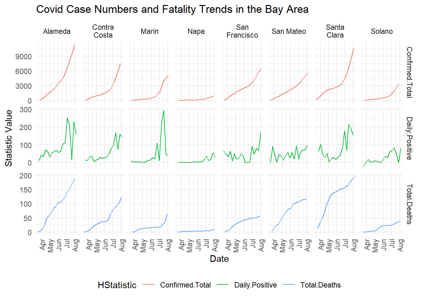
Update 7/13/2020 - Note the Red colored curves (Confirmed Total). Alameda, Marin, Solano and Contra Costa counties seem to be accelerating (Parabolic), whereas the other counties countinue to have the same slope (not parabolic). The simultaneous comparision of the Daily Confirmed Cases (the Green line) completes the picture of which Counties are currently facing the most difficulty with getting the numbers in control.
Update 7/8/2020 - While case numbers are rising Deaths due to Covid19 seem to diverge in Marin, Napa, and Solano Counties
Update 6/28/2020 - The numbers are clearly spiking now. See Marin for example. Note, I’ve removed the log scale on the Y-axis to give a better sense of the comparision between the Counties. I personally think the logscale gives a better sense of growth, however, there is a sense that log-scales can be confusing to interpret. Another reason for switching the scale, is to demonstrate potential case numbers if the daily positives continue to grow. Clearly population has a final role to play, however, for the time being some of these trajectories are comparable. California also reformatted the data they release on the 26th of June to include hospital bed capacity. We’ll take a look at the goldilocks zone for California in a new post.
The data for the overview of the Google Mobility Data for the States of CA and NY, along with a break up of the Mobility data for the Bay Area was accessed on 27th May 2020.
Google Mobility Data - Data from Mid May
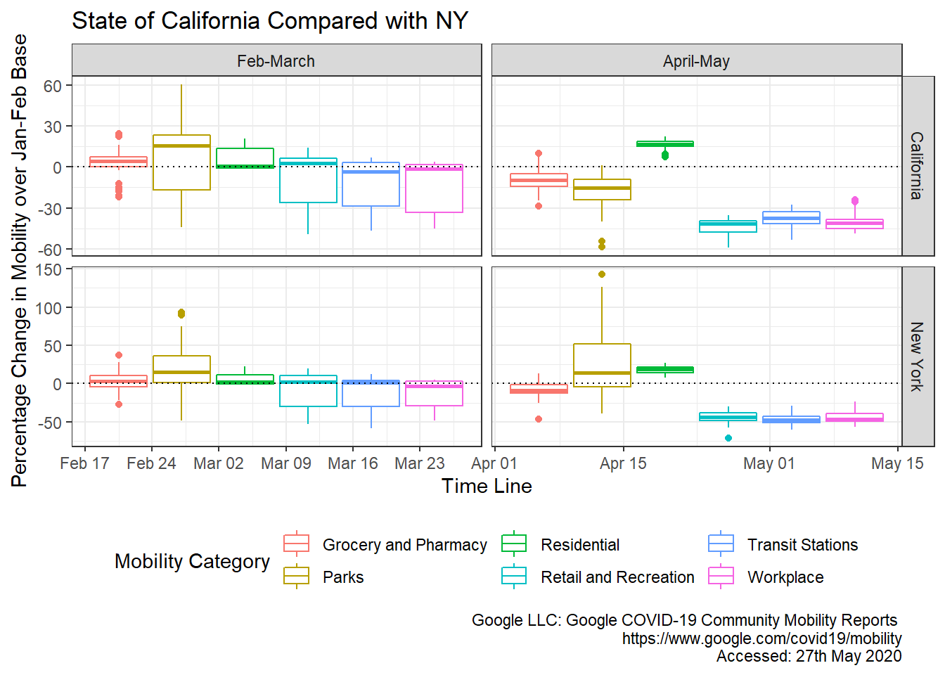
Discussion - Limited to the Month of May
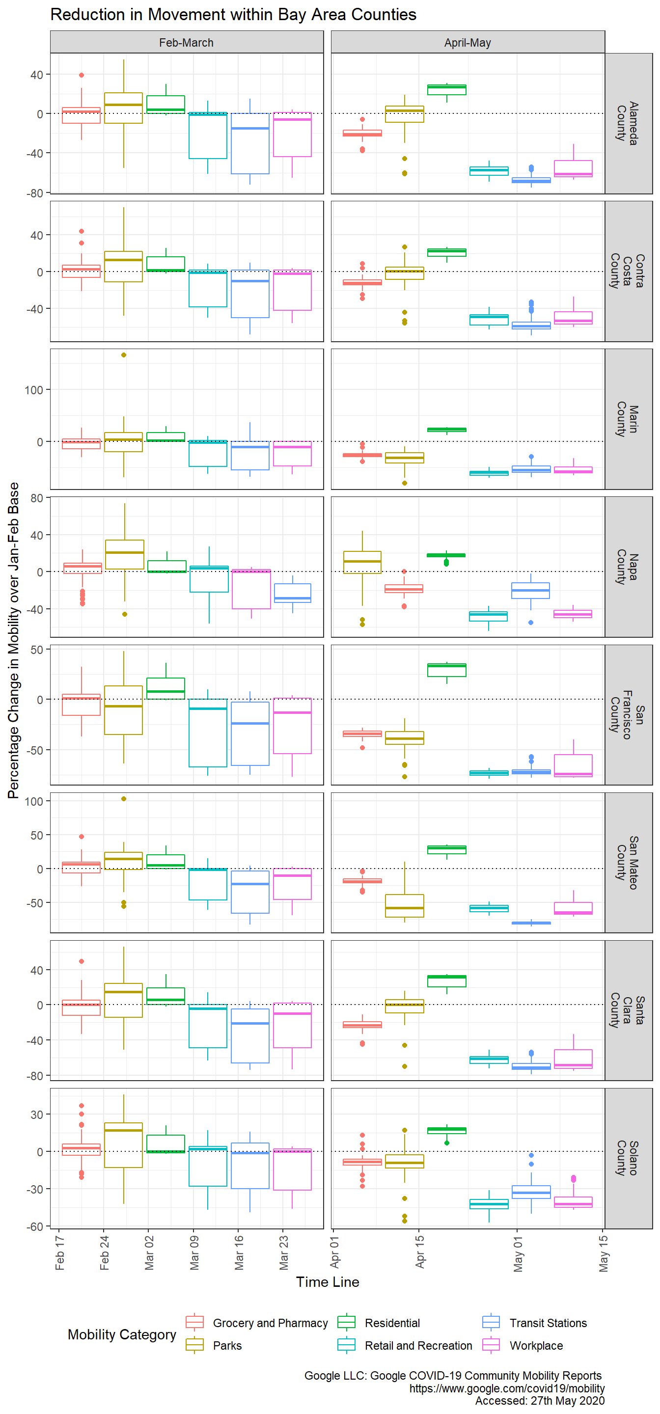
The Daily Positive cases in the trajectory plot provides insight into the incidence of Covid19 given the restrictions in place that can be visualized in the boxplots. As we open up, absent any developments in the form of agressive testing and contact tracing, the Daily Positive case numbers will rise. This set of information forms a baseline for comparision.
Compare Alameda and San Mateo, for example, to Contra Costa and Santa Clara counties. Despite restrictions in movement, case numbers have maintained a steady state. Is this because individuals in these counties have been ignoring the Shelter-in-Place (SiP) regulations, or is there some other cause? Could it be density of population, or even demographics?
Here’s what the Bay Area mobility data looks like ..
I’m not particularly happy with this plot, so any suggestions on how to improve it would be welcome. On the face of it, it doesn’t seem like there was a particular county that was ignoring the SiP regulations.
Data Sources:
California Covid19 Hospital and Case Statistics
Code on Github: